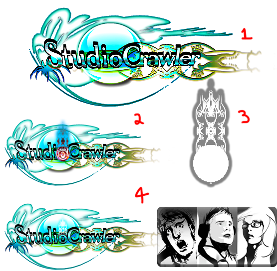
Number 3 could be used as our concept branding. It seems out of place at the moment, I haven’t changed it at all; this was used at the beginning of our animatic. You guys agreed on the simplistic design and font. It’s definitely something to consider, or if you’re fine with the contemporary, Australian styled beach logo? That would be fine too.
3 comment(s) to "Logo Design"
About This Blog
StudioCrawler is a team of students working together on a collaborative project at the University of the Creative Arts Rochester, studying CG Arts & Animation. Stick by and watch us as we are challenged to create an animated film trailer for the festival Retro-Fest. Keep an eye on our news section and Twitter feed for latest StudioCrawler news and updates.
Members
Followers
Blog Archive
-
▼
2011
(109)
-
▼
November
(21)
- Prop Development - Completed Desk
- Prop Development: Completed Radio
- Prop Modelling Development 1
- Turnarounds for Props
- Final Attempt of the Alpha Spider Model
- Beginning the Modelling of The Alpha/Mother Spider
- Completed Spider Drone Model
- (@Adam and Sean) Concept: Character turnarounds
- Concept: Vincent turnaround
- Concept: Rick turnaround
- Concept: Linda turnaround
- Model Production of spider - Head
- Final attempt for Character and Environment Props 1
- Spider Turnabouts
- References for Environment 'Props'
- First Sketches and ideas for props in environment/...
- (@Adam and Sean) Development: Environmental Interp...
- Resolved Logo Design (V3)
- Logo Design
- (@Sean and Adam) Concept: Lady Presenter (V2)
- Inspiration for 1950's style of world and characters
-
▼
November
(21)
Labels for work
- Briefing (1)
- Checklist (1)
- Concept (12)
- Development (92)
- Group Message (5)
- Ideas (31)
- Influence Maps (1)
- Introduction (1)
- Modelling (20)
- Planning (1)
- Pre-Production (61)
- Production (79)
- Retro-Fest (1)
- Script (3)
- Storyboard (1)
- Temporary (2)
- animatic (4)


Adam Webb says:
Some nice designs Dayle and yes I do like idea 3 for it's simplicity because it is more professional looking in my opinion
I think the australian styled beach theme needs redesigning because currently our logo looks like something for a holiday resort instead of a production film studio
However as I mentioned before I do like the colour scheme and the spider on the left corner I also like the strange blue flowing shapes in the background
So this is just a suggestion but what if you simply replaced the beach scene in the foreground shape with the simple one in logo 3 as development idea
I quite like the red eye you created in design 2 in the O as well but I think adding the characters as you have done in design 4 gives to much away and would mean the design would only ever be suited to one animation
Really good ideas, I think we are not to far in finding a good logo from this and hopefully will discuss all the work from the past week tomorrow and get these final things resolved
Great work Dayle :)
tutorphil says:
I have to agree with Adam about the semiotics of these designs - it just seems too sunny, too benign, to surfy for a film company making a movie about giant robot spiders! I'd strip it right down and go for something more confident and less decorative.
Anonymous says:
I agree with both Adam's and Phil's comments, firstly with Adam's, i agree that number three is a nice idea, simple but effect, it also played well in the studio ident in the animatic. maybe design 3 can be something to build upon or develop from?
Also with both, our design is looking, like said above, to surfy and sunny, the designs are still very good but capture the wrong idea i think we want. The colour scheme however i think works, it feels modern, calm and cool, has a sci-fi appeal to it as well. but for both to work it may need, as Phil said, simpler shapes/design and maybe a more structured/string line feel, maybe towards the style of the robotic elements of our story.
I like the adaptation of the character pictures into the template to, nice effect :)